UPSKILL MATH PLUS
Learn Mathematics through our AI based learning portal with the support of our Academic Experts!
Learn moreStatistics is a branch of mathematics that deals with the collection, organisation, presentation and analysis of data. Statistical data has great use in different fields such as research, medicine, education, economy, business and weather.
In previous classes, you learned how to collect data, arrange it in a frequency distribution table and visualise it using pictograms, tables, and bar graphs.
Why we need a bar graph to represent data?
Sometimes, when a large number of data is organised in tabular form, it is not easy to draw meaningful conclusions. But, if the same data is represented pictorially or graphically, it becomes easier to understand and analyse. Here, we discuss the bar graph and its types.
A bar graph is a pictorial representation of data. A bar graph consists of equally spaced parallel bars (Horizontal or Vertical) whose lengths/heights will vary according to the number of items given.
We can use bar graphs to show the relative sizes of many things, such as what flavour of ice cream people have, how many customers a shop has on different days, etc.
Example:
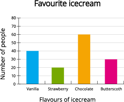
Consider the following bar graph.

This bar graph shows the relative number of favourite ice creams among the different flavours. It can be directly concluded from the graph that 'Group of people feels that Chocolate flavour is the favourite ice-cream'.