
PDF chapter test TRY NOW
1. The frequency distribution:
| Marks | 0 - 20 | 20 - 40 | 40 - 60 | 60 - 100 |
| Number of students | 10 | 15 | 20 | 25 |
has been represented graphically as follows:
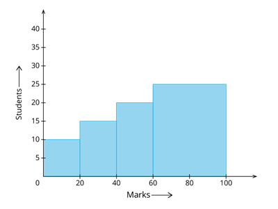
Do you think this representation is correct? Why?
2. Is it correct to say that in a histogram, the area of each rectangle is proportional to the class size of the corresponding class interval? If not, correct the statement.
 Register for free to see more content