PUMPA - SMART LEARNING
எங்கள் ஆசிரியர்களுடன் 1-ஆன்-1 ஆலோசனை நேரத்தைப் பெறுங்கள். டாப்பர் ஆவதற்கு நாங்கள் பயிற்சி அளிப்போம்
Book Free DemoThe bar graph is another prominent way to give visual representation to the data as a pictograph.
But why we need a bar graph to represent data? Sometimes, when a large number of data is organized in tabular form, it isn't easy to draw meaningful conclusions. But, if the same data is represented pictorially or graphically, it becomes easier to understand and analyze it.
But why we need a bar graph to represent data? Sometimes, when a large number of data is organized in tabular form, it isn't easy to draw meaningful conclusions. But, if the same data is represented pictorially or graphically, it becomes easier to understand and analyze it.

Here, we discuss the bar graph and its types.
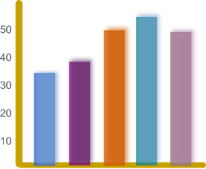
A bar graph is a pictorial representation of data. A bar graph consists of equally-spaced parallel bars (Horizontal or Vertical) whose lengths/heights will vary according to the number of items given.
Key things to remember:
- The lengths of the bar depend upon the frequency and the scale chosen.
- The width of each bar is the same.
- The space between any two bars is also the same.
In the upcoming lessons, we explore the various types of bar graphs and how we can represent to optimize immense data.
Reference:
https://pixabay.com/vectors/productivity-statistics-bar-chart-148197/